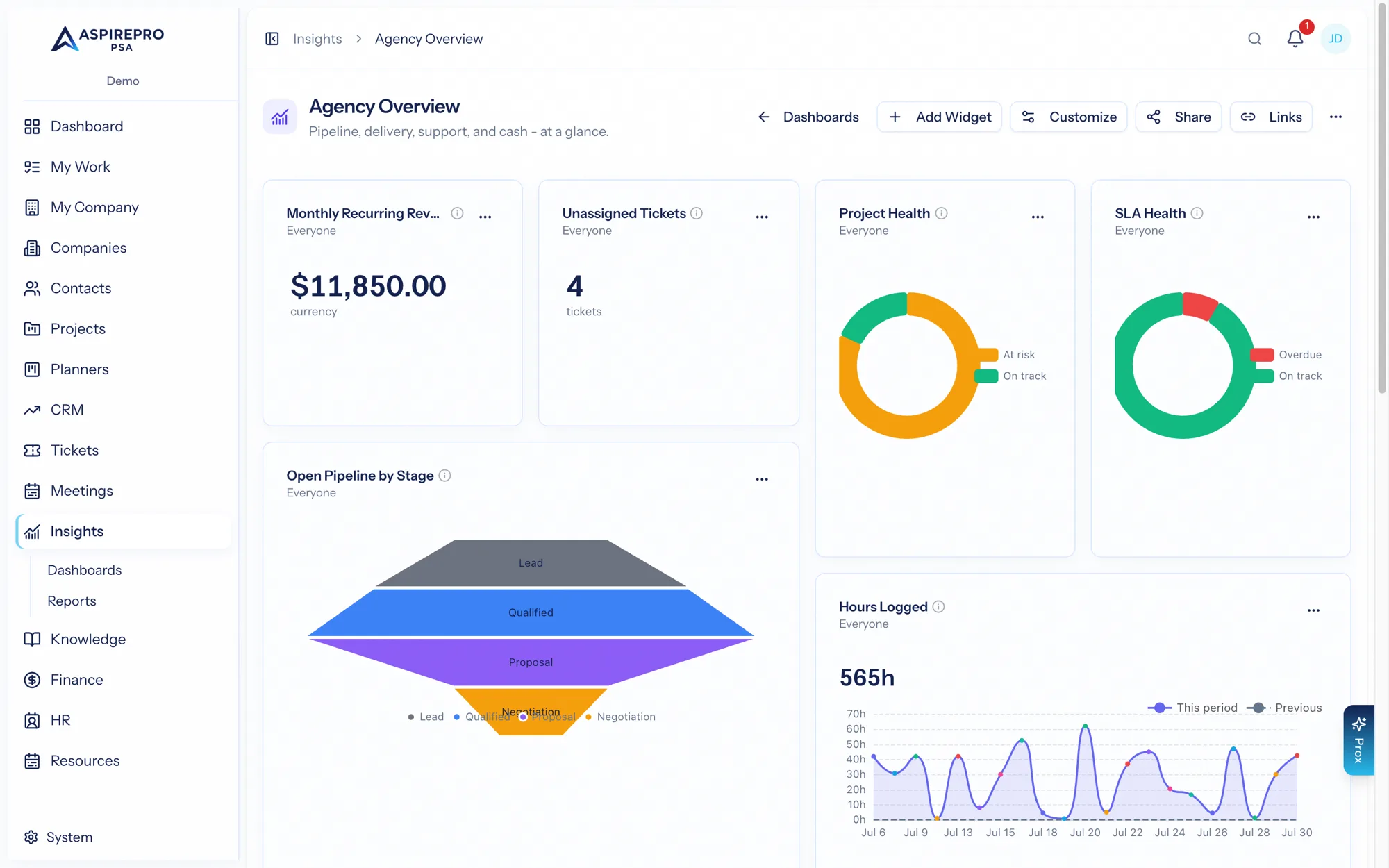
A dashboard is made of widgets, and each widget is a metric shown as a visualization with its own settings. Building a dashboard is choosing the right metrics and laying them out to answer one question.
Suggested dashboards#
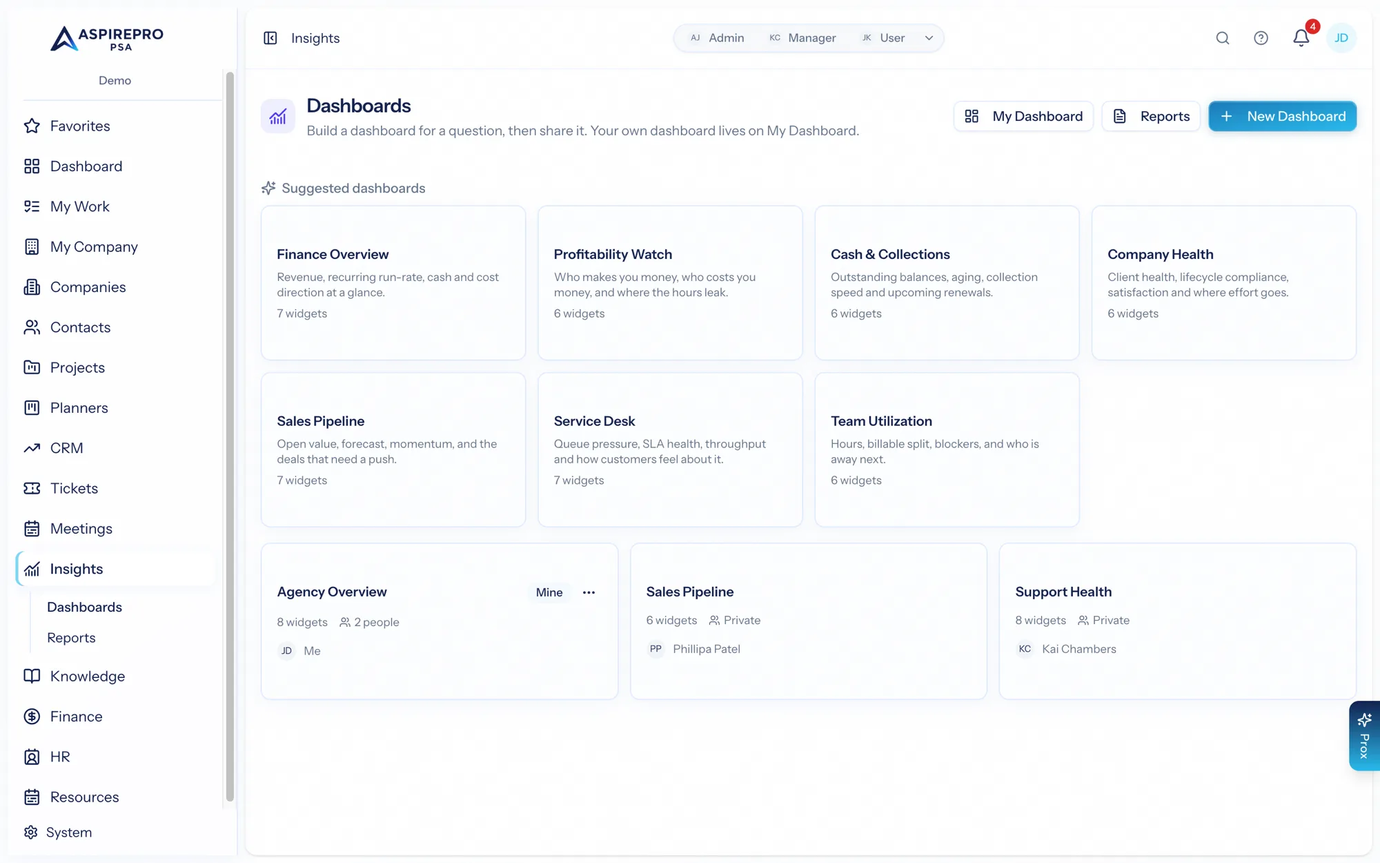
Not sure where to start? The Insights page offers suggested dashboards — curated widget sets for a purpose: Finance Overview, Profitability Watch, Cash & Collections, Company Health, Sales Pipeline, Service Desk, Team Utilization, and Outbound (dials per day, connect and reply rates, what happened on each touch, and where every call block stands). Pick one and choose where it goes:
- A new dashboard — created and laid out in one click.
- An existing dashboard — either replace its widgets, or add alongside them (widgets whose metric is already on the board are skipped, so applying a template twice never duplicates anything).
Widgets for metrics you can't access are skipped automatically — a template never smuggles data past a permission.
You can also just ask Prox: it can build a dashboard from a template, lay out widgets, and share the result for you (see Sharing).
Adding widgets#
Use Add Widget to browse the metrics catalog (grouped by area) and drop one onto the dashboard, or drag from the palette onto the grid. Each widget stores its settings — but never a fixed scope; scope is always re-derived from whoever's viewing (more on that in Metrics catalog).
Visualizations#
Each metric supports the visualizations that make sense for its shape, and you can switch between them inline with Show as…. The selectable types are:
- Number and value — a single headline figure.
- Bar — compare across categories.
- Columns — the same comparison, vertical — available wherever Bar is.
- Donut — parts of a whole.
- Funnel — stages that narrow (a pipeline).
- Gauge — progress toward a target.
- List — the underlying records.
- Trend — change over time.
A metric only offers the visualizations that are honest for its data, so you can't accidentally misrepresent it.
Scope and date range#
Most metrics take parameters you set inline:
- Scope — mine, my team, or everyone — so the same metric can show your numbers, your team's, or the whole organization's.
- Date range — today, this week, this month, this quarter, this year, or a custom range.
Change these on a widget and it re-runs instantly with the new view.
Arranging and drilling in#
- In customize mode (owner/editor), drag and resize widgets on the grid, and show or hide them. Hidden widgets aren't deleted — you can bring them back.
- Duplicate a dashboard to branch from it — the copy starts private (shares aren't copied).
- Drill into any widget to see the actual records behind the number, with deep links straight to those tickets, deals, invoices, or tasks.
Resilient by design#
Widgets survive change: if a metric is renamed or you lose access to it, the widget shows a clear "this metric is no longer available to you" tile rather than vanishing or erroring — so a dashboard never silently loses meaning.
Start from the question, pick the two or three metrics that answer it, choose the visualization that reads cleanest, and set the scope to the audience. A focused five-widget dashboard beats a cluttered twenty-widget one every time.